

I was pleasantly surprised on Sunday past to awaken to an email informing me that the Monarchist League of Canada has chosen my design as the winner of its Platinum Jubilee emblem competition.
My winning design was one of several that I developed. I spend much of my free time designing things from stationery to mugs to tote bags, but rarely do I enter design competitions. For me, design is an enjoyable pastime. I have always favoured simple, contemporary, and ‘flat’ designs, evocative of designs from the pre-digital era.
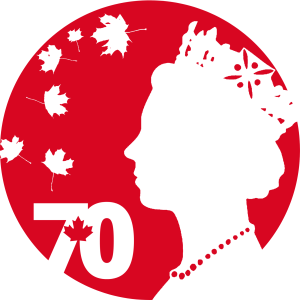
I decided from the outset that my entry to the competition would follow my favoured design principles. Given the contest rules stated no text was permitted except for simple text that could be read in both French and English, I knew I would need to ensure my message was conveyed symbolically. I struggled over whether to use a serif font for what I envisioned as being the main design element: the ‘70’. In the end, I decided that a confident, modern, fresh sans-serif with an integrated maple leaf looked best. I also knew that I wanted to use a profile of the Queen; my favoured version being one similar to that used on Canadian coins from the 1980s to the 1990s given its iconic status.
I created several iterations but felt something was missing. Without wanting to make the design too ‘busy’, I decided to experiment with maple leaves – not the pop-art type like that used in the ’70’ icon, but rather leaves that look like those found on our national tree. I decided that six natural looking maple leaves, scattered around the design adjacent to Her Majesty’s image looked best. The leaves combined with the stylised maple leaf in the ’70’ icon symbolises the seven decades of Her Majesty’s reign. The design uses negative (white) space to depict the symbols on a red circular background. The shade of red was derived from that used in the Canadian flag.
After I submitted my design, the Monarchist League kindly pointed out that one of the free-falling leaves looked as though it was about to ‘tickle’ the nose of Her Majesty (it’s always best to have another pair of eyes look at a design because it is easy to miss these things). This issue was easily resolved with a quick edit to relocate the leaf in question.
I didn’t expect my design to win, as I thought it was a bit simple. I was pleasantly surprised when I was emailed this past weekend informing me that I had won. I was further touched by the many kind messages forwarded by the Monarchist League from other League members and supporters who, it would seem, liked my design very much.
I am honoured that my design will be used by the League throughout the Platinum Jubilee year and that it has been so well received by other League members.
Photo by Ben Cheung from Pexels


