

2014 · CBU Students’ Union Logo
Online · Print Material · Products
Designed for the Cape Breton University Students’ Union as part of a re-brand in 2014, this logo included the basic shield element from the previous logo placed within an off-centre square in a special Pantone orange selected for use as part of the brand identify for the organisation. The logo is placed over sans-serif font utilising colour and grey to create a strong focus on the organisation’s primary role as a student union.
The logo was used online and in print by the organisation, as well as on various promotional products sold and distributed by the Union.
The re-brand included subsidiary logos for each of the Union’s subsidiary organisations such as the Pride and Ally Centre and The Women’s Centre, as well as a flag to be flown from the Union building facade.


2019 · Postage Stamp for the Letter Writers Alliance
The Letter Writers Alliance was a letter writing organisation active from 2007 to 2020. When its closure was announced in 2019, I designed a farewell stamp suitable for use by members around the world through the various ‘customised stamp’ services available by national postal services.
The stamp design was distributed by the Letter Writers Alliance for free use by members.

2020 · St Peter’s Church Logo
Online · Print Material
Designed for St Peter’s Anglican Church in Fawkner (Victoria, Australia), this logo incorporates the traditional coat of arms of St Peter in a contemporary design alongside the church name in sans-serif font.

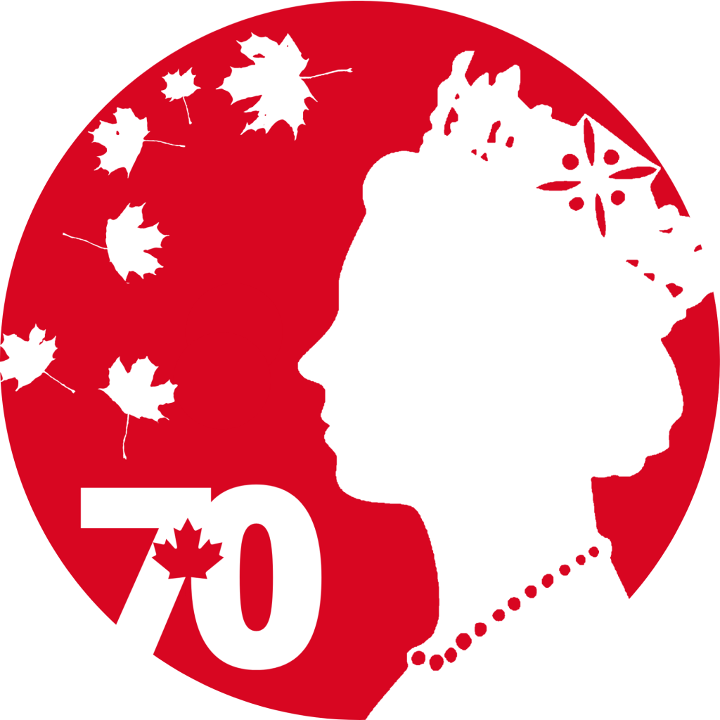
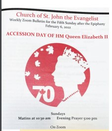
2021 · Platinum Jubilee Emblem
Envelope Seals · Print Material
Designed for use by the Monarchist League of Canada to commemorate the Platinum Jubilee of Queen Elizabeth II, this emblem was selected winner of a competition held by the League to find an emblem for use by the League alongside the official Canadian jubilee emblem.
The emblem contains the profile of the Queen from the middle of her long reign alongside seven maple leaves – six in free fall and one integrated into a 70 emblem – each representing a decade of the Queen’s reign as Queen of Canada.
The emblem was unofficially adopted by other organisations, including a church in Montreal.


2022 · King Charles III Emblem
Envelope Seals · Print Material
Designed at the request of the Monarchist League of Canada for use as an envelope seal and as a graphic on print material, this emblem features the profile of King Charles III atop a maple leaf laurel and the League coat of arms.


2022 · Golden Jubilee Emblem
Apparel and Accessories · Print Material
Designed for the Coburg Historical Society (Coburg, Victoria, Australia), this emblem was used by the Society to celebrate its fiftieth anniversary from July 2022 to July 2023.
This project involved reconstructing the Society logo for the digital age, as the copy held by the society was suffering from generational degradation and pixellation. The jubilee emblem included the arched wording above the standard logo.
The emblem was used on print material as well as tote bags and special edition anniversary wine and port.


2023 · Coronation Emblem
Envelope Seal · Print Material · Enamel Lapel Pins
Designed at the request of the Monarchist League of Canada, this emblem features the royal cypher of King Charles III surrounded by a wreath of maple leaves. ‘Charles III’ appears at the bottom and the word coronation in both French and English appears at the top alongside the date of the coronation (6 May 2023).

2023 · Book Cover
Printed Book · Promotional Material
Designed for Downingfield Press Proprietary Limited, this cover features artwork and typography. The design will form the framework for a number of unique book covers as part of Downingfield’s 2023 poetry series.


